Website refresh or redesign – how to tell which one your site actually needs
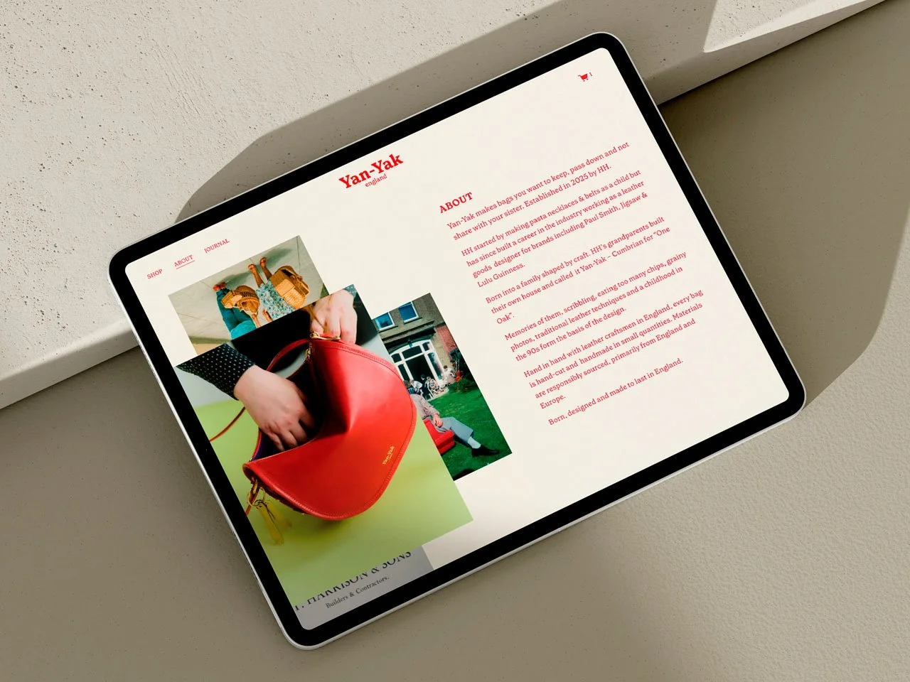
Yan Yak – Branding and Squarespace website design
A website can stop serving your business long before anything is obviously wrong. It loads, it has pages, it contains accurate information – but it no longer serves its purpose. It doesn't reflect where the business is now, or it did once and somewhere along the way it stopped.
At that point, many founder-led businesses ask the same question: does the website need a refresh or a complete redesign? The question sounds like a technical one. It isn't. It's a diagnostic one. And getting the diagnosis right before spending time or money on a solution is what this post is about.
Who this guide is for
This article is written for founders and service-based businesses wondering whether their existing website still supports where the business is today. Although I specialise in Squarespace website design, the questions in this guide apply whether your website is built in Squarespace or another platform.
Website refresh vs redesign: what's the difference?
The confusion is understandable because both involve change, and both result in a better site. But they're different interventions addressing different problems.
A refresh works on the visual layer. Typography, colour, photography, graphic elements – the things that determine how a site looks and feels. The structure stays. The pages stay. The user journey stays. What changes is the presentation. A refresh is the right move when the foundations are sound but the site has lost its edge – when it feels dated, or no longer reflects the visual identity the brand has grown into.
A redesign goes deeper. It reviews the site's information architecture, navigation, user experience, and how it actually functions – often rebuilding from a clearer brief than the one the original site was built from. A redesign is the right move when the problem isn't how the site looks but how it works. When the structure no longer serves the business it's representing.
The distinction matters because applying the wrong solution costs time and money without fixing the underlying problem. A refresh on a site with structural issues will look better but still underperform. A redesign on a site that simply needs updating visually is more than the situation requires.
How to diagnose which one you need
The fastest way to tell is to separate the visual from the structural and ask honest questions about each.
Start with the visual layer. Does the site still reflect your current brand – the colours, typography, and photography you'd use if you were briefing a designer today? Does it look like the business you're running now, or the one you were running when it was built? If the visual identity has evolved and the site hasn't caught up, a refresh may be all that's needed.
Then look at the structure. Has the site grown in ways the original build didn't anticipate? Are there pages that were added without considering how they fit the whole? Does a visitor arriving for the first time have a clear sense of what you do, who it's for, and what to do next – or do they have to work for it? Is the navigation intuitive, or has it become cluttered by layers of addition?
Finally, consider the brief. When the site was originally built, was the business fully formed – or has it since changed direction, expanded its offering, or found a clearer sense of who it's for? A site built on an incomplete brief often needs more than a refresh can give it, because the problem isn't the execution. It's the foundation.
Why the wrong diagnosis is common
Businesses rarely notice structural problems as they develop. New services are added, pages grow organically, messaging evolves, and what once felt clear gradually becomes more complicated. Because these changes happen over time, it's easy to assume the problem is visual when it's actually structural. That's why it's worth diagnosing the underlying problem before investing in either.
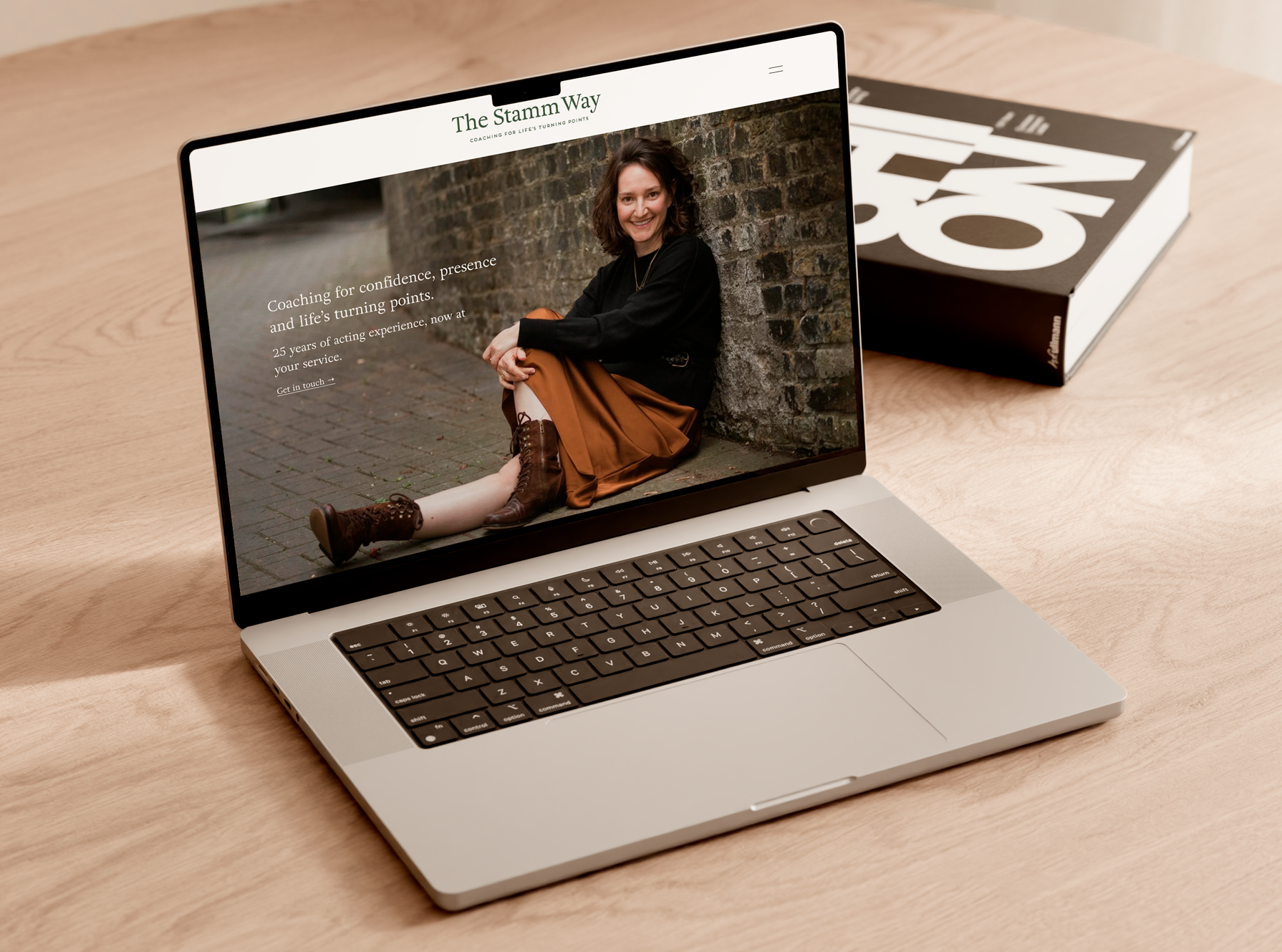
The Stamm Way – Branding and Squarespace website design
A few questions worth sitting with
If you're unsure which category your site falls into, these are worth working through honestly:
Does the site reflect your current brand? Not the brand you had when it was built – the one you have now, or the one you're building toward.
Can a first-time visitor understand what you do within the first two minutes? If you have to explain the site rather than letting it speak, that's a structural question, not a visual one.
Has the site grown by addition rather than intention? Pages added as needed, calls to action accumulated, sections that made sense at the time but no longer fit the whole – these are signs that the structure needs reviewing, not just the surface.
Does the problem feel visual or functional? Be honest about this one. A site that looks dated but works well needs a refresh. A site that looks fine but doesn't perform – doesn't convert, doesn't communicate, doesn't reflect where the business actually is – needs more.
What it looks like in practice
I recently worked with a client who came to me thinking she needed a refresh. Her Squarespace website had been built carefully when she launched her business, and it had served her well for several years. But businesses don't stay still. Offers evolve, new services get added, and the natural response is to add pages as the need arises – without stepping back to look at the site as a whole.
That's what had happened. Page by page, offer by offer, the original structure had been overtaken by additions that made sense individually but had quietly dismantled the coherence of the whole. The intuitive user journey that made the original site work well was gone. The user experience no longer matched what you'd expect from the quality of services she provides.
Once we talked through the difference between a refresh and a redesign, it became clear that what she needed was the latter. Not because anything was wrong with how the site looked – she'd built something she was attached to, and rightly so – but because the structure underneath was no longer fit for purpose.
We kept the feel. We stripped back everything else, rebuilt the architecture, simplified the backend so she could manage it herself, and improved load time in the process. Same site, in the sense that it still felt like her. Different foundations, in the sense that it now worked properly and supported the way her business operates today.
That distinction – same feel, rebuilt foundations – is usually what a redesign produces when it's done well. Not a new site. A better version of the right one.
Sign up for Studio Notes and download our free checklist: Before You Start. Five areas, a set of prompts to work through at your own pace, and space to write your answers – before you brief a designer or begin a build